The South Asian
Football Collective
A logo design and brand identity, complete with a full set of brand identity guidelines.
Changing the Narrative
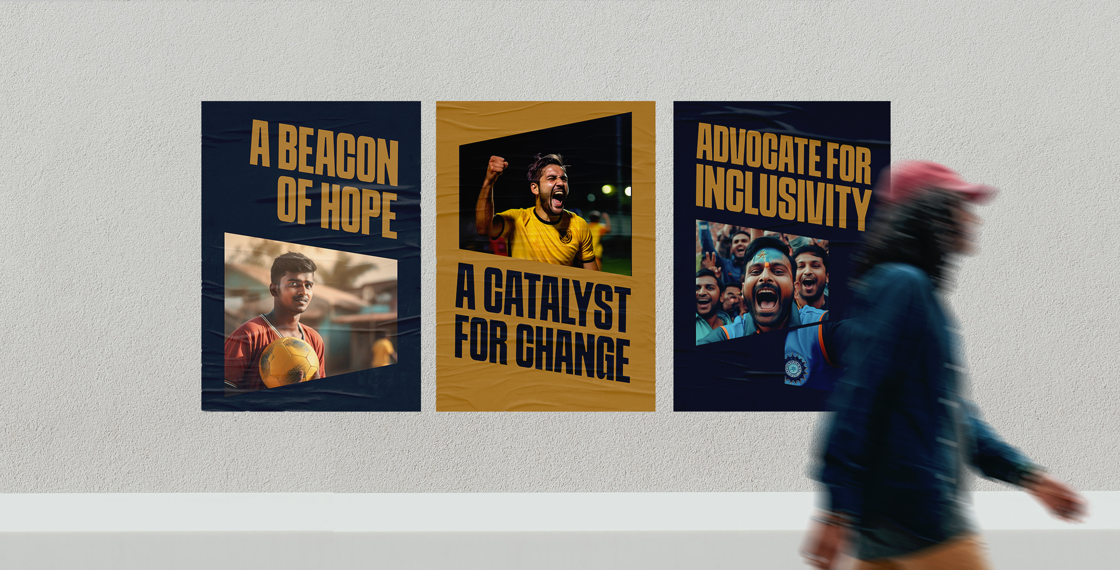
In a universally beloved sport, The South Asian Football Collective stands out as a beacon of hope and a catalyst for change, championing diversity and celebrating the significant contributions made by people of South Asian descent.

A Logo Design that
Stands for More
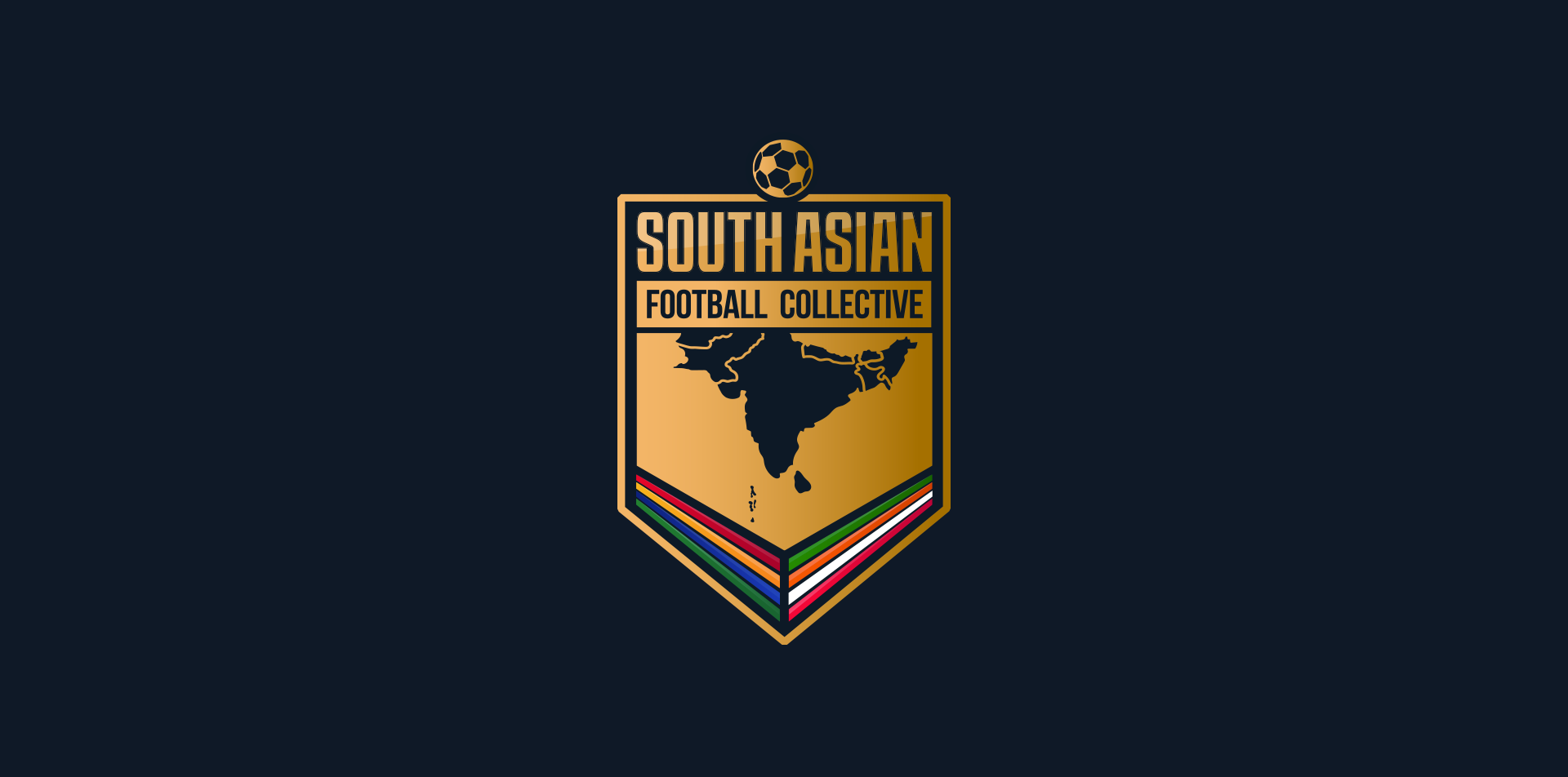
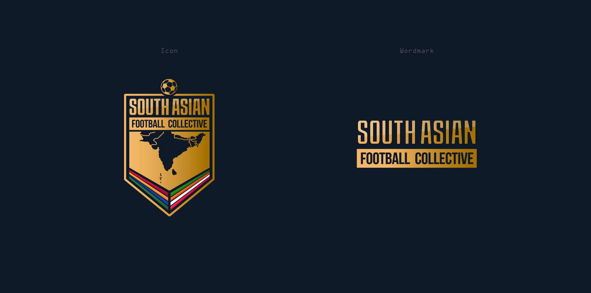
In a culture where Gold represents achievement, success and recognition, it was only fitting that the logo design and brand identity of an organisation dedicated to promoting, championing, and celebrating South Asian participation was coated in luscious gold.
A Brand Identity that
Commands Attention
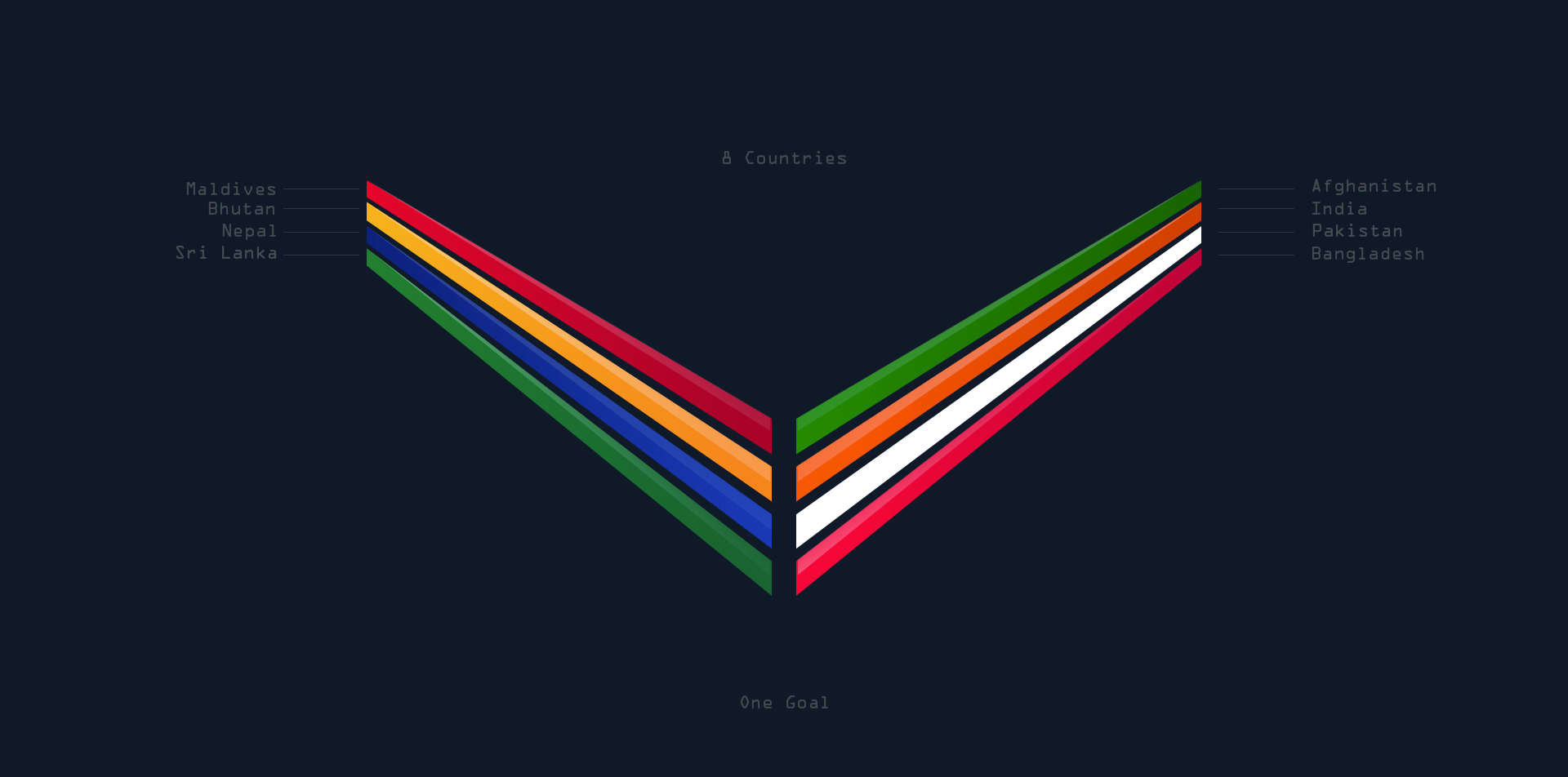
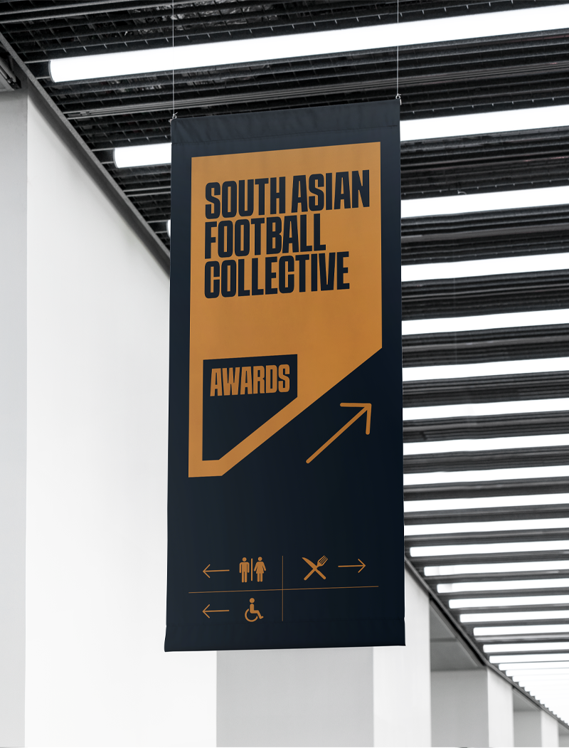
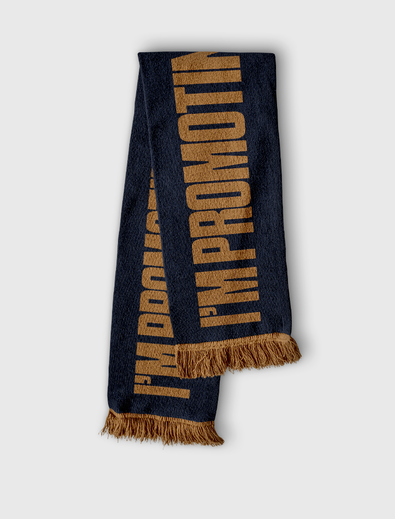
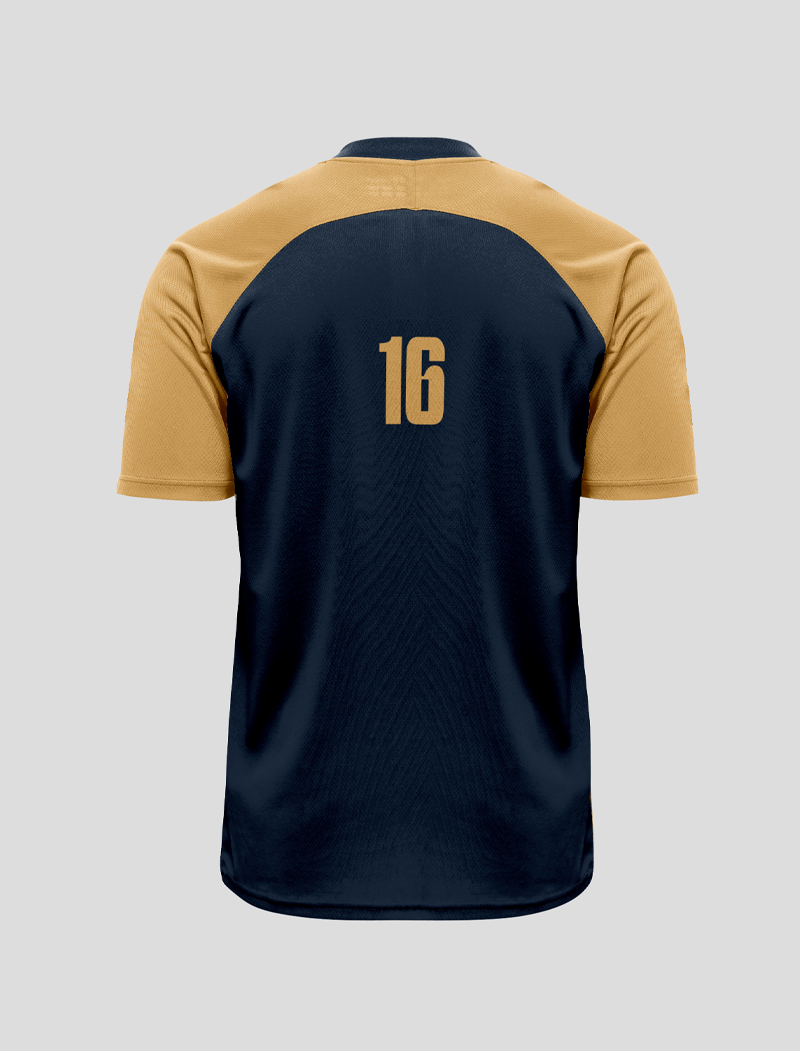
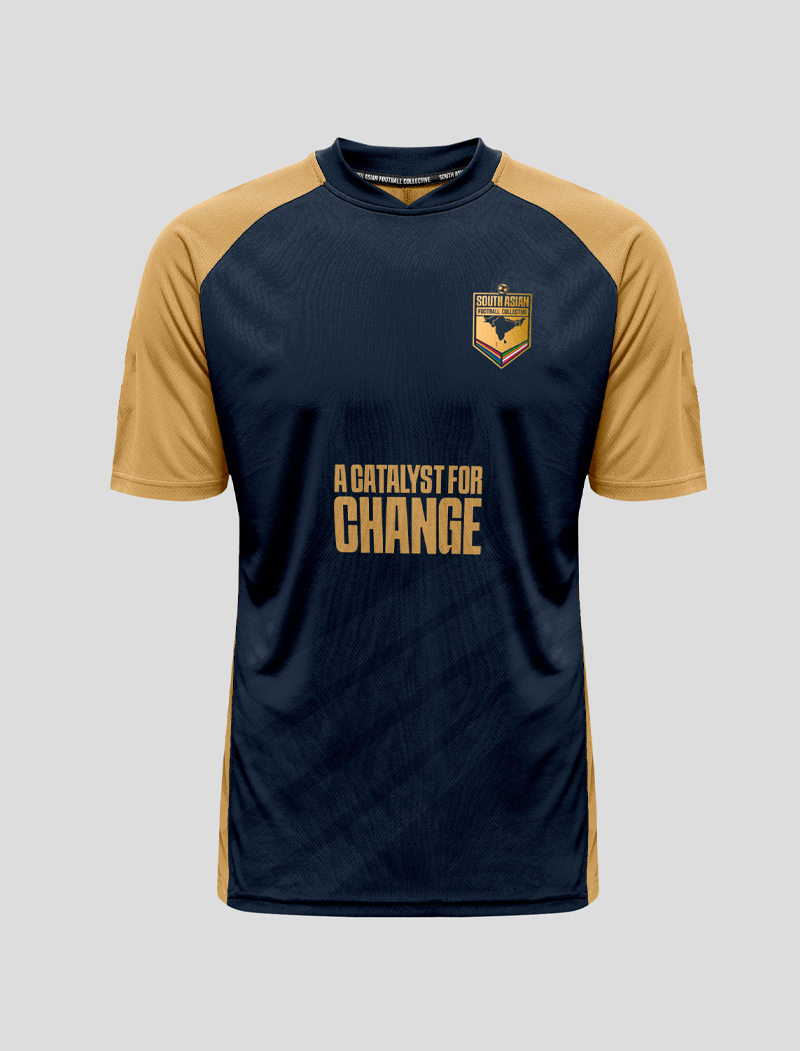
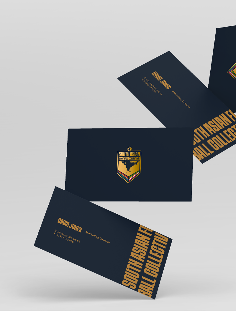
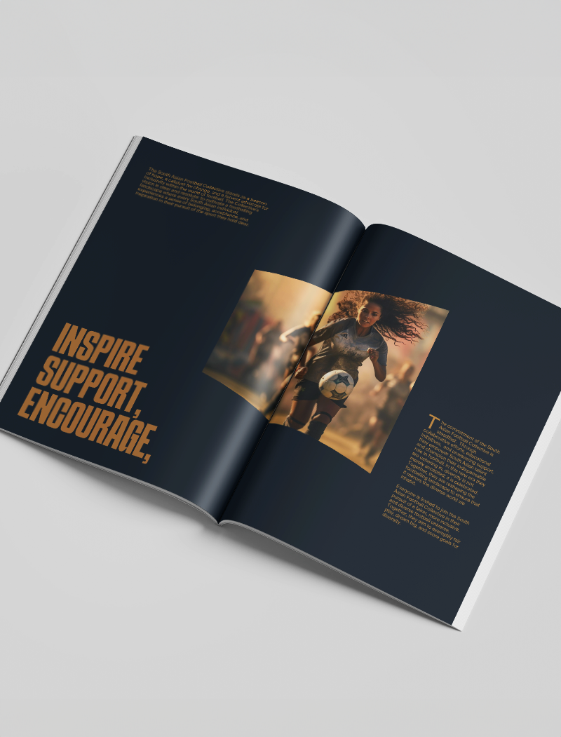
The brand identity for The South Asian Football Collective was carefully crafted to be as impactful as possible. Acting as a visual reminder of the organisations aim, to help those of South Asian descent in football to stand out.


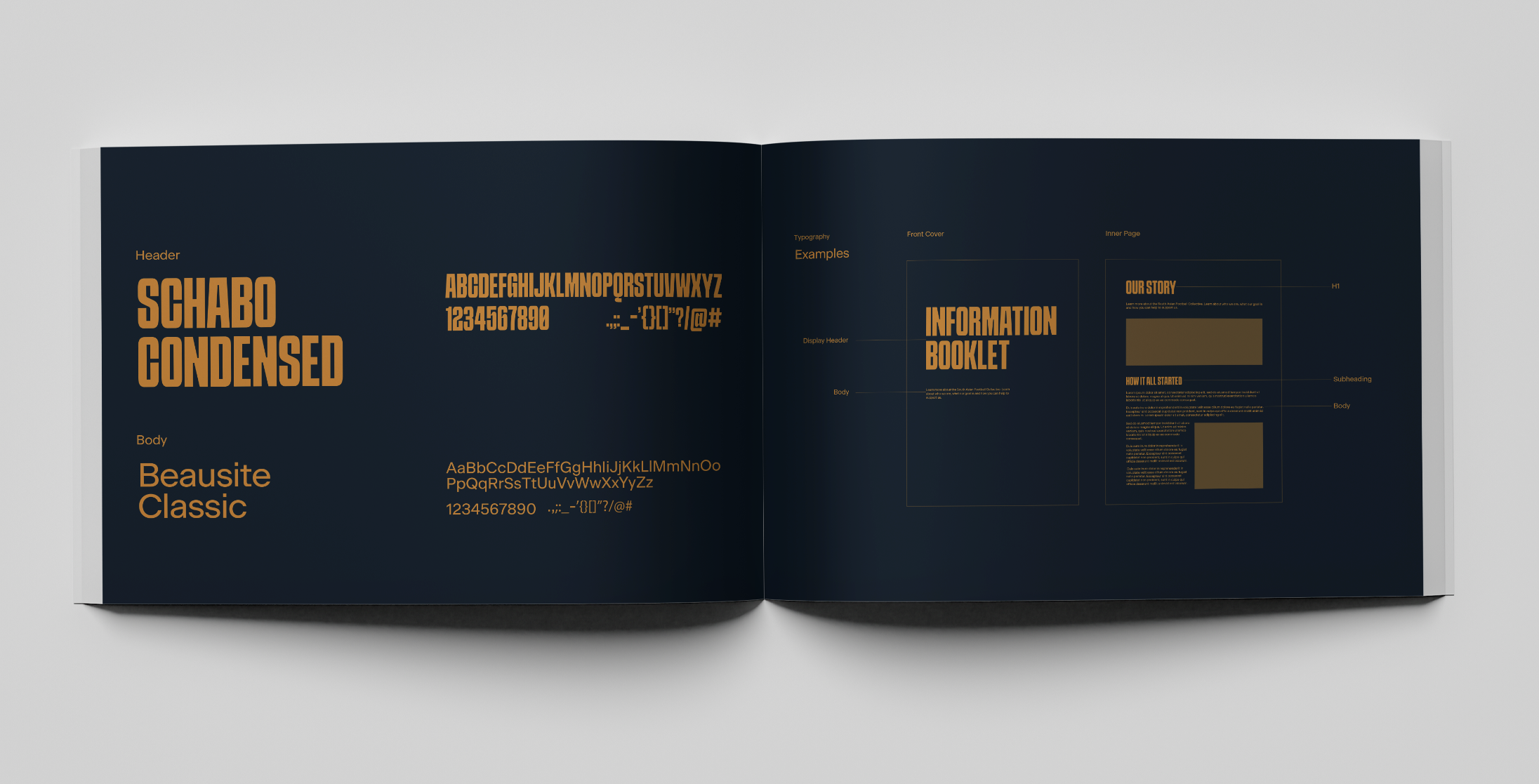
Typography
Headings
SCHABO CONDENSED
1 2 3 4 5 6 7 8 9 0
Body
Beausite Classic
Aa Bb Cc Dd Ee Ff Gg Hh Ii Jj Kk Ll Mm Nn Oo Pp Qq Rr Ss Tt Uu Vv Ww Xx Yy Zz
1 2 3 4 5 6 7 8 9 0
Brand Identity Colours
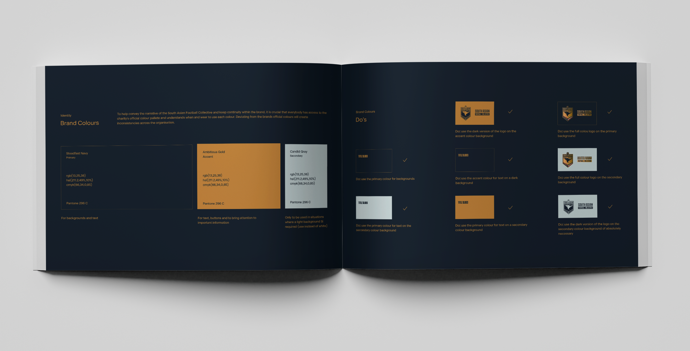
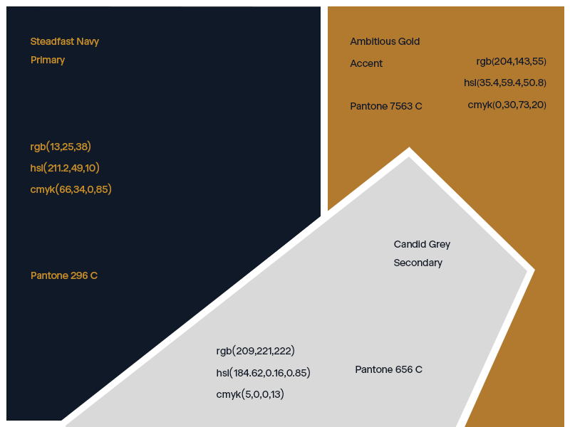
Steadfast Navy is the brand’s primary colour. It stands for the resolute devotion South Asians have had in football for many years.
Candid Grey portrays the silence that has taken place for so long in football when it comes to diversity and equality.
Ambitious gold represents celebration, recognition and a change in football, seeing people of South Asian descent recognised for their vital contribution to the sport.




A Complete Set of
Brand Identity Guidelines
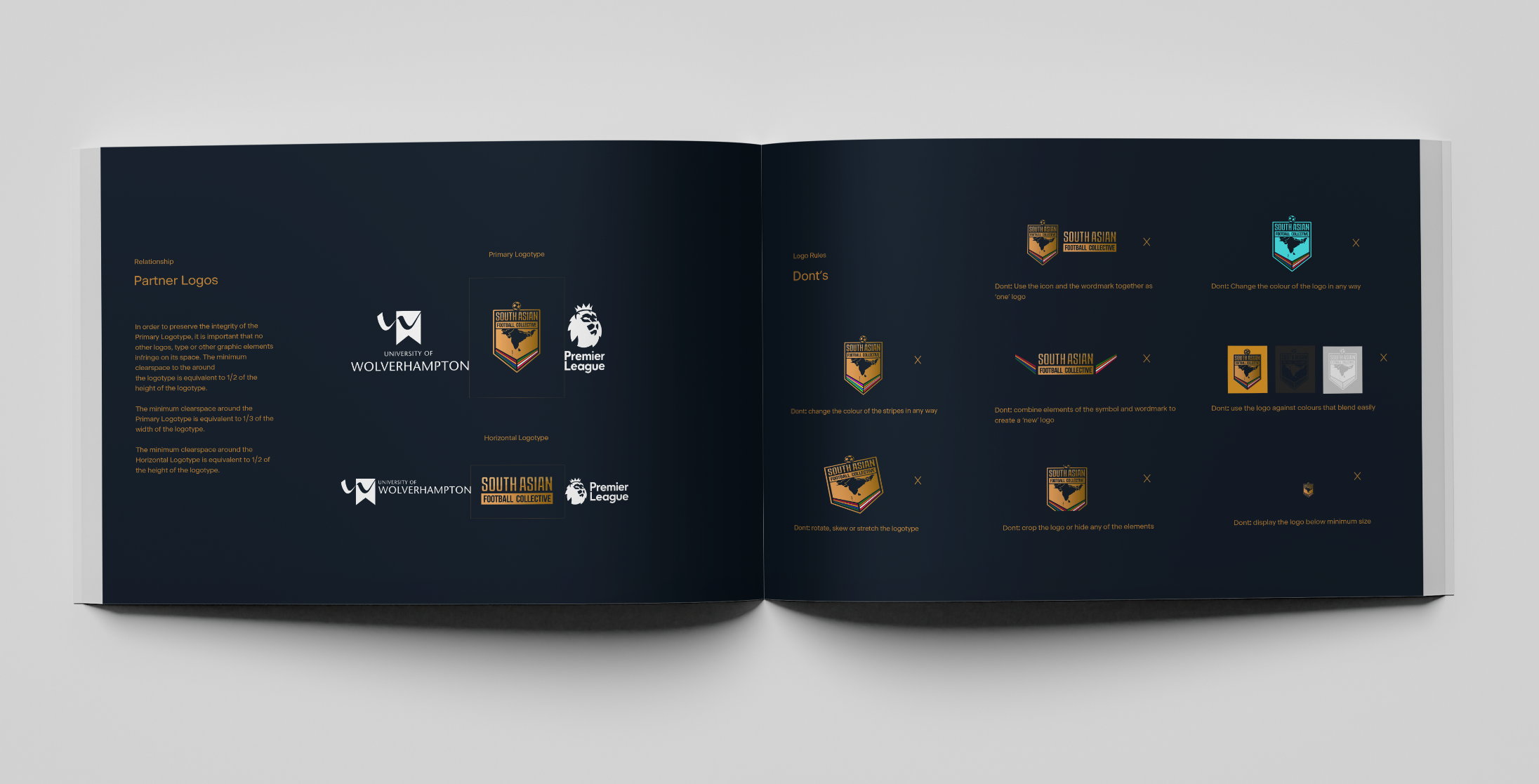
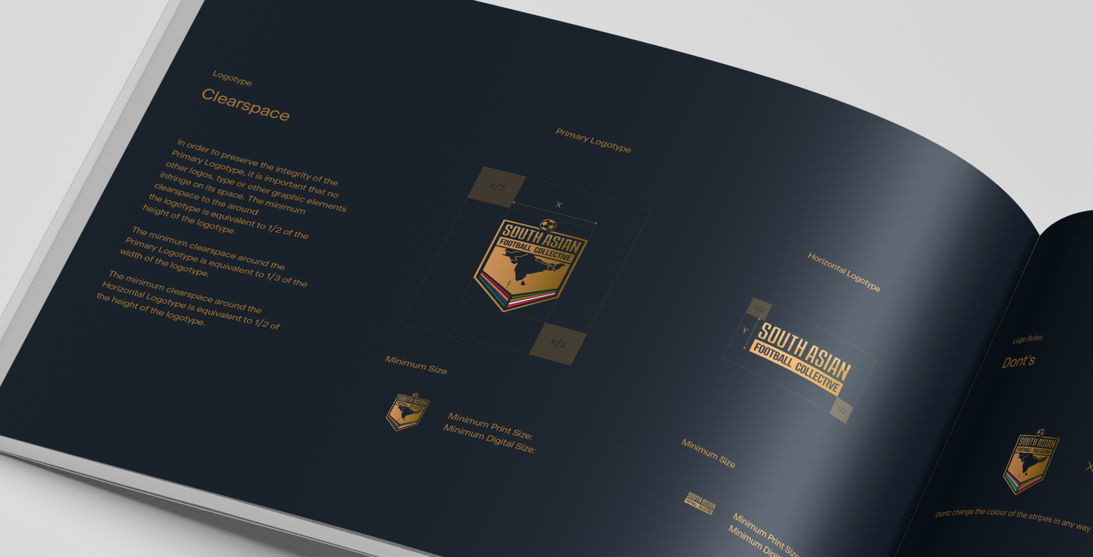
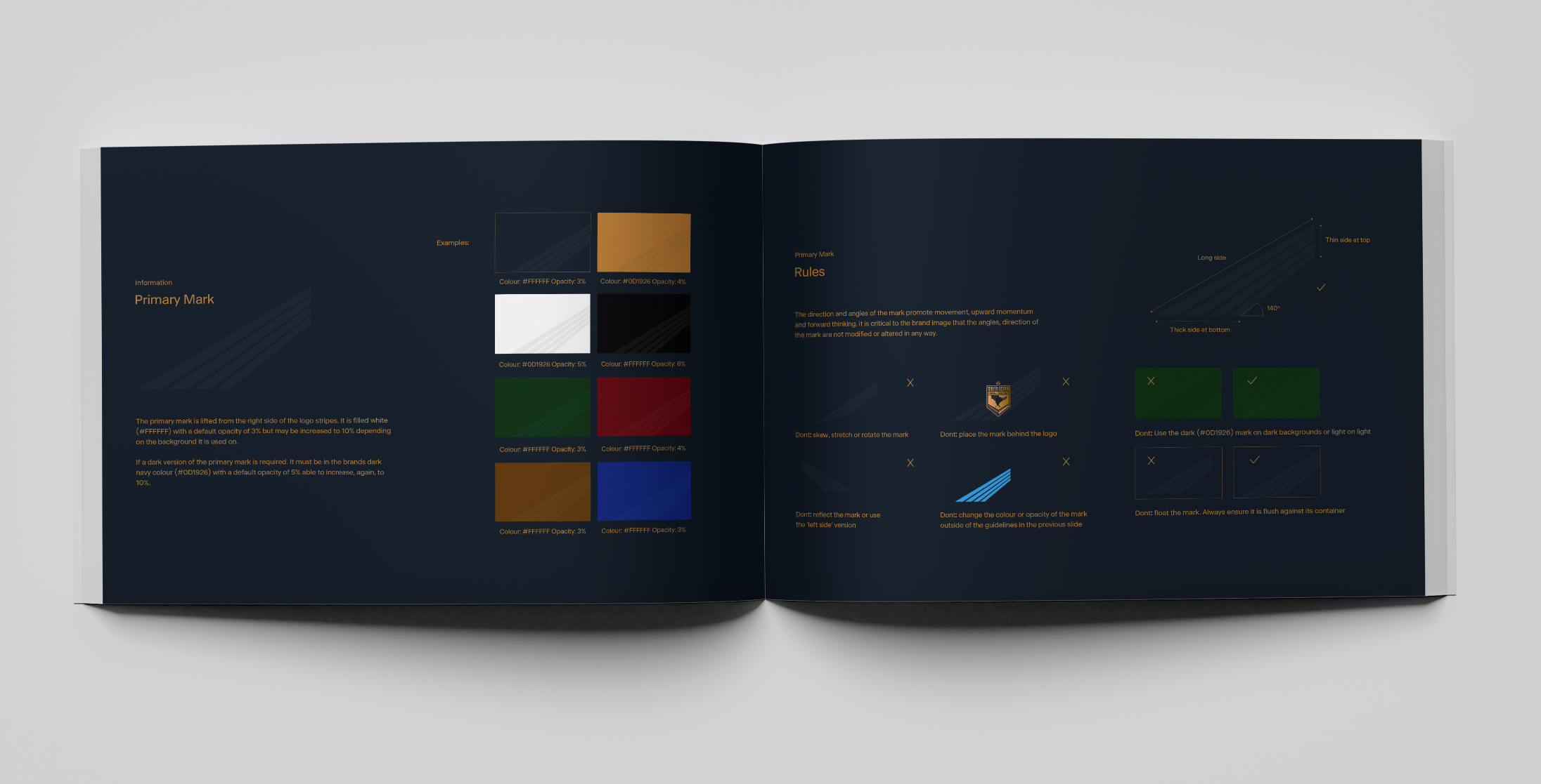
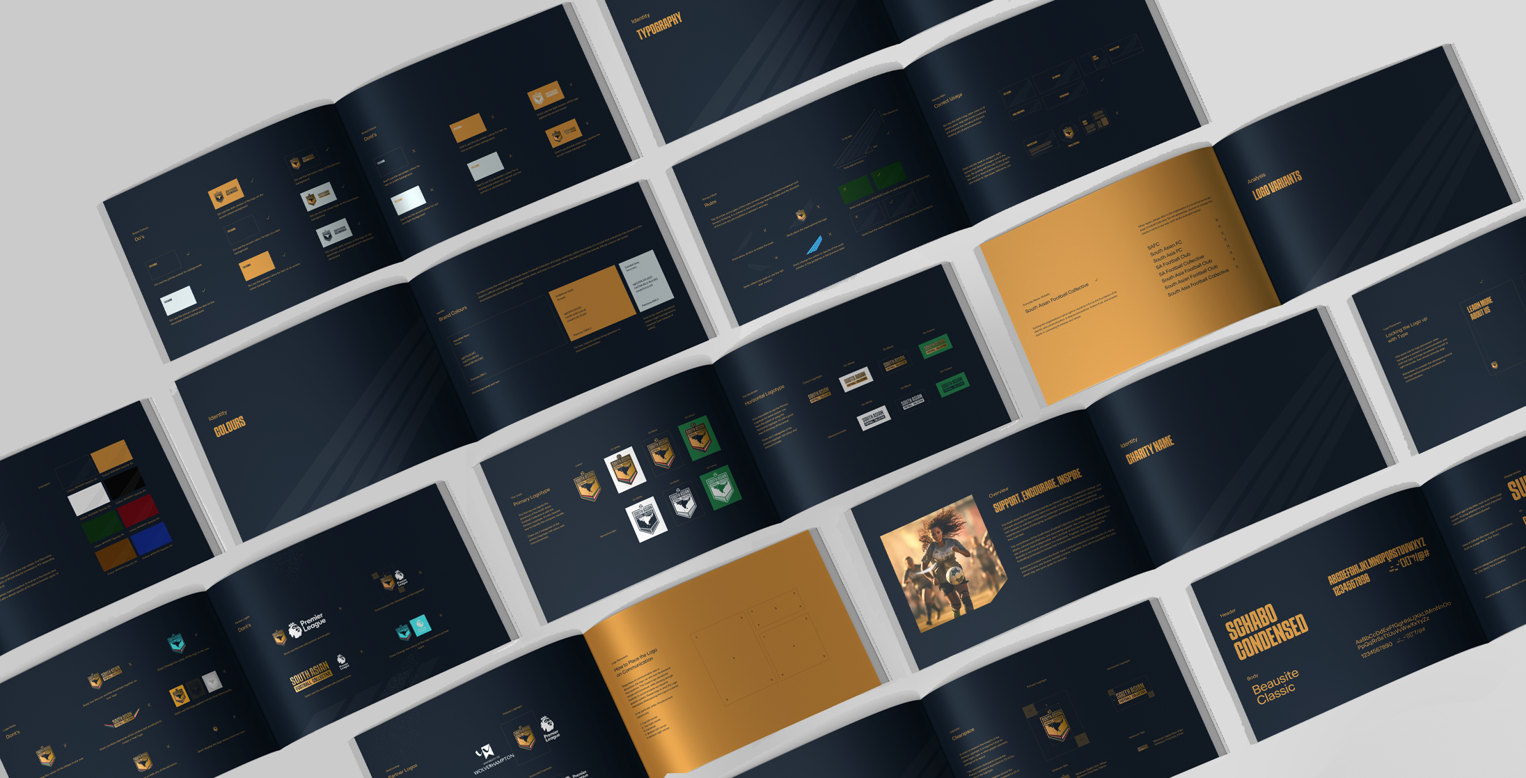
Brand continuity is crucial to the success of any new organisation. A complete set of logo design and brand identity guidelines were created for staff members to follow. As well as ourselves, who are the official digital partner of The South Asian Football Collective.

