Fleetcard
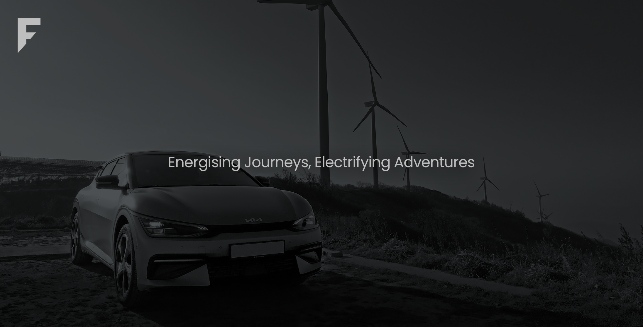
An electrifying logo design and brand identity for a Shell-Authorsied EV members group.
An Electrically Charged
Logo Design
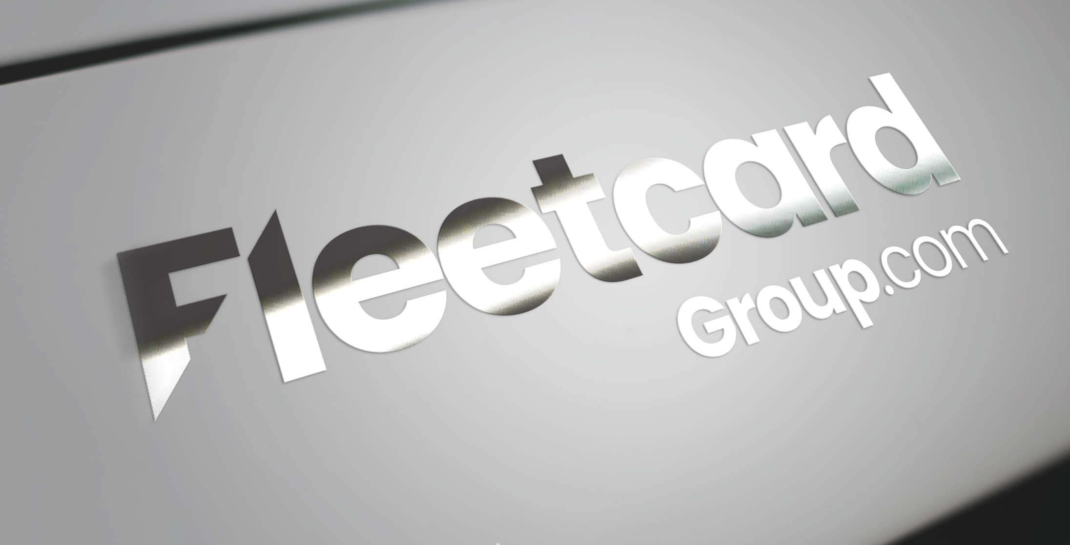
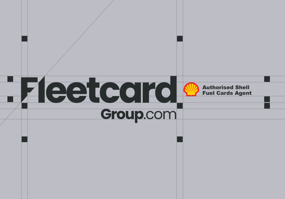
A design inspired by electricity and energy. This unique take on the letter F mimics a bolt of lightning and perfectly matches Fleetcard’s brand; with the ethos to provide its members with cost-effective solutions for their electric vehicles.
A Brand That's More Than
Just A Brand Identity
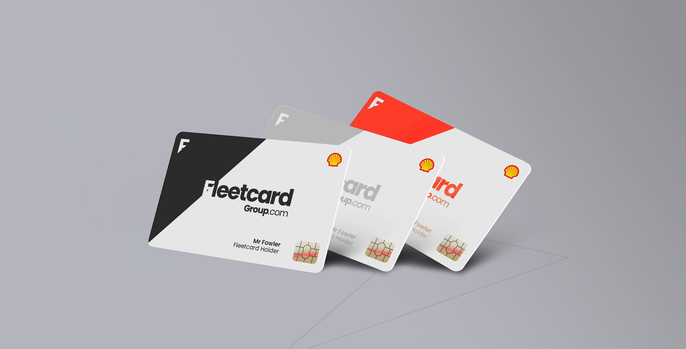
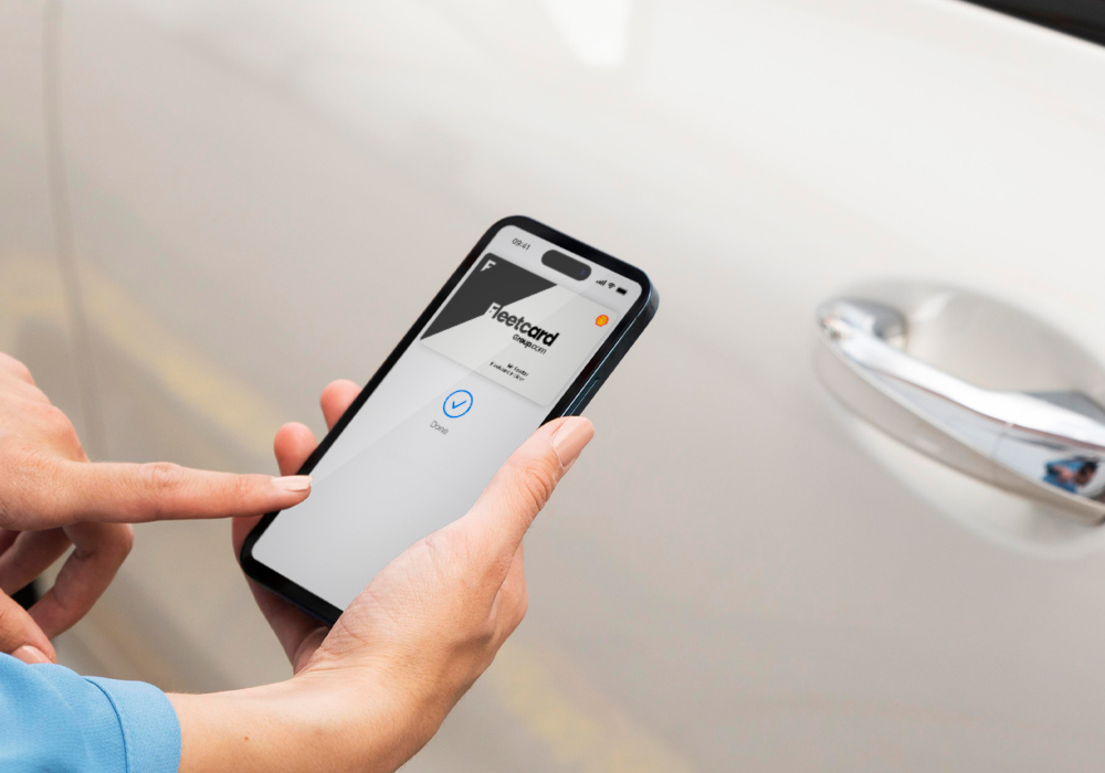
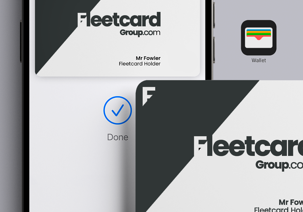
Fleetcard provide an all-in-one card solution for electric charge points, promoting renewable and sustainable energy at a lower cost. Their identity goes beyond the visuals of their branding and provides it’s members with a cost-effective way to run their beloved electric vehicles.
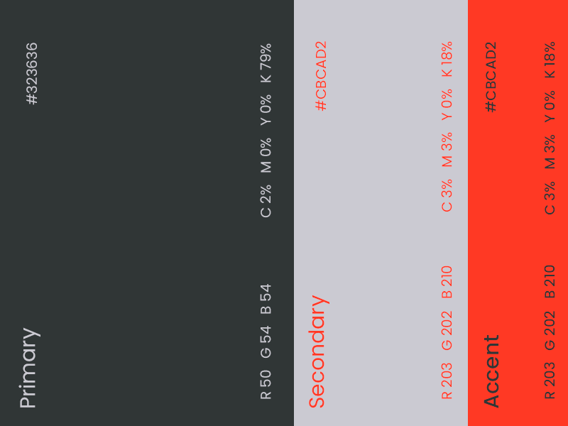
Brand Identity Colours
A composed and placid grey is the primary colour for the brand identity, a colour that perfectly reflects a sustainable energy solution.
Paired with a futuristic and fully-charged orange accent colour that points to an innovative and energy-efficient future, the brand identity is the perfect mix of efficiency and energy.

Typography
Headings
Poppins Bold
Aa Bb Cc Dd Ee Ff Gg Hh Ii Jj Kk Ll Mm Nn Oo Pp Qq Rr Ss Tt Uu Vv Ww Xx Yy Zz
1 2 3 4 5 6 7 8 9 0
Body
Poppins Regular
Aa Bb Cc Dd Ee Ff Gg Hh Ii Jj Kk Ll Mm Nn Oo Pp Qq Rr Ss Tt Uu Vv Ww Xx Yy Zz
1 2 3 4 5 6 7 8 9 0

Spreading the Word through
the Brand Identity
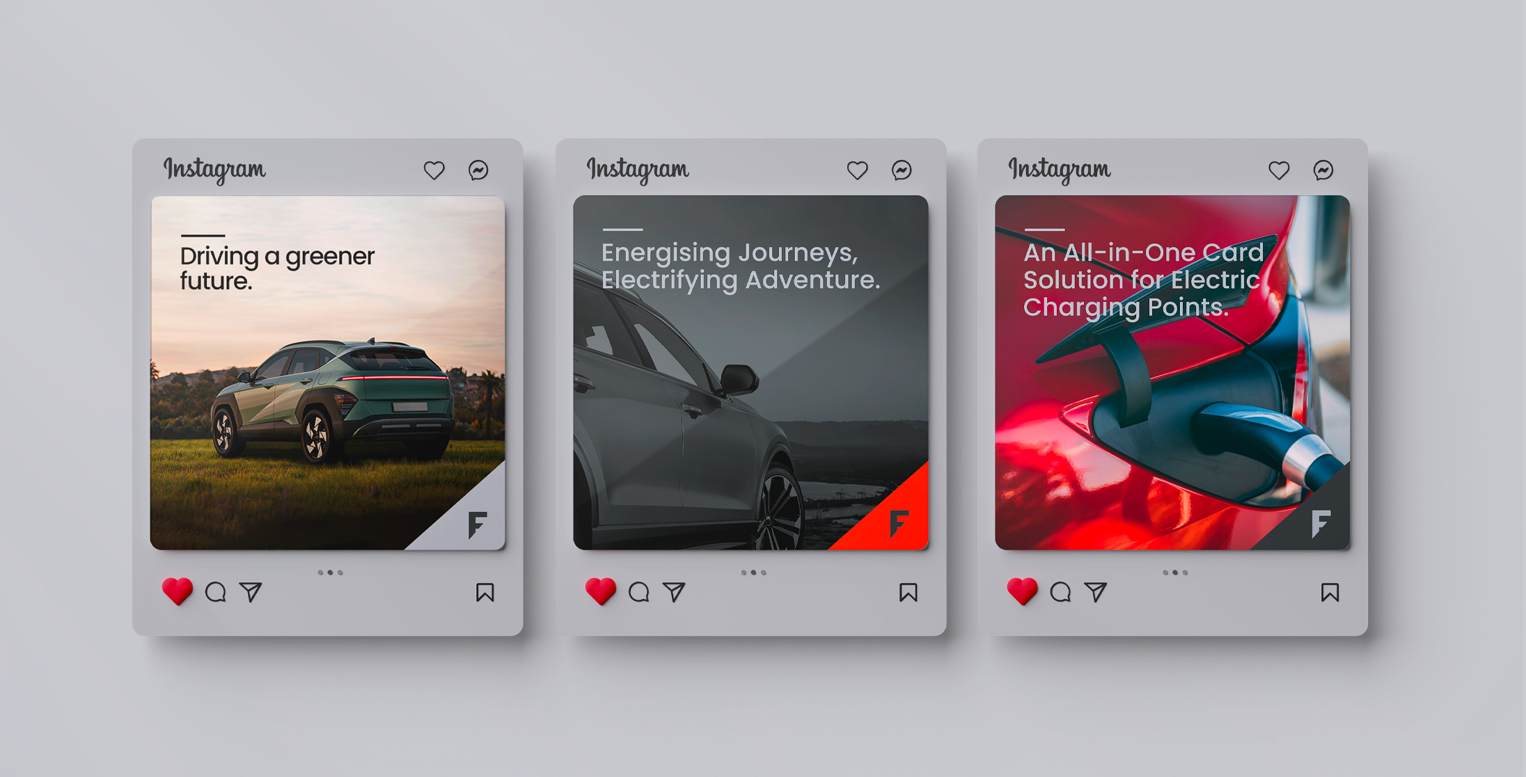
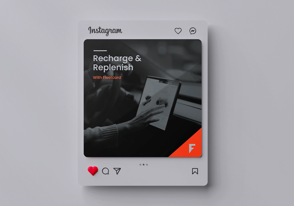
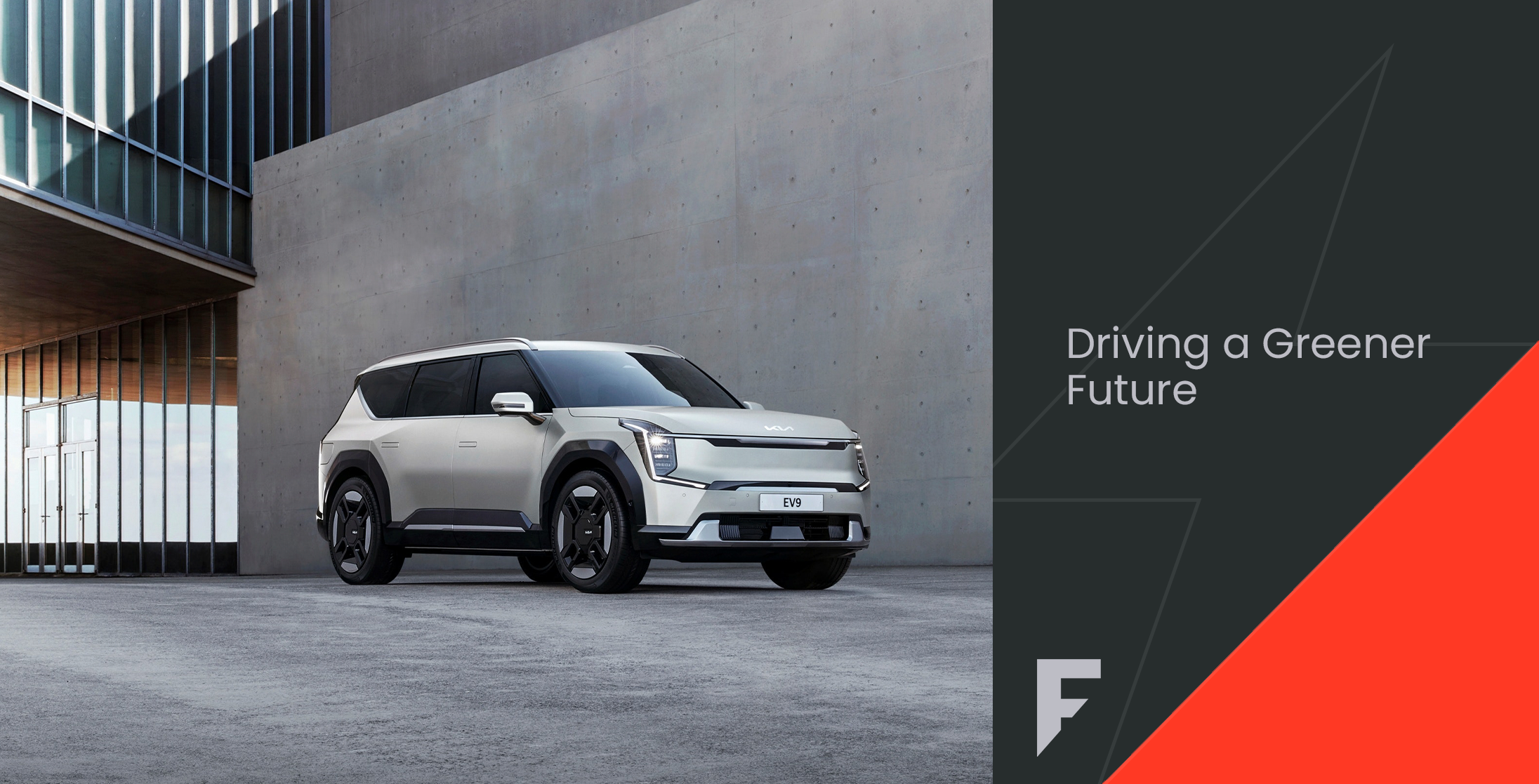
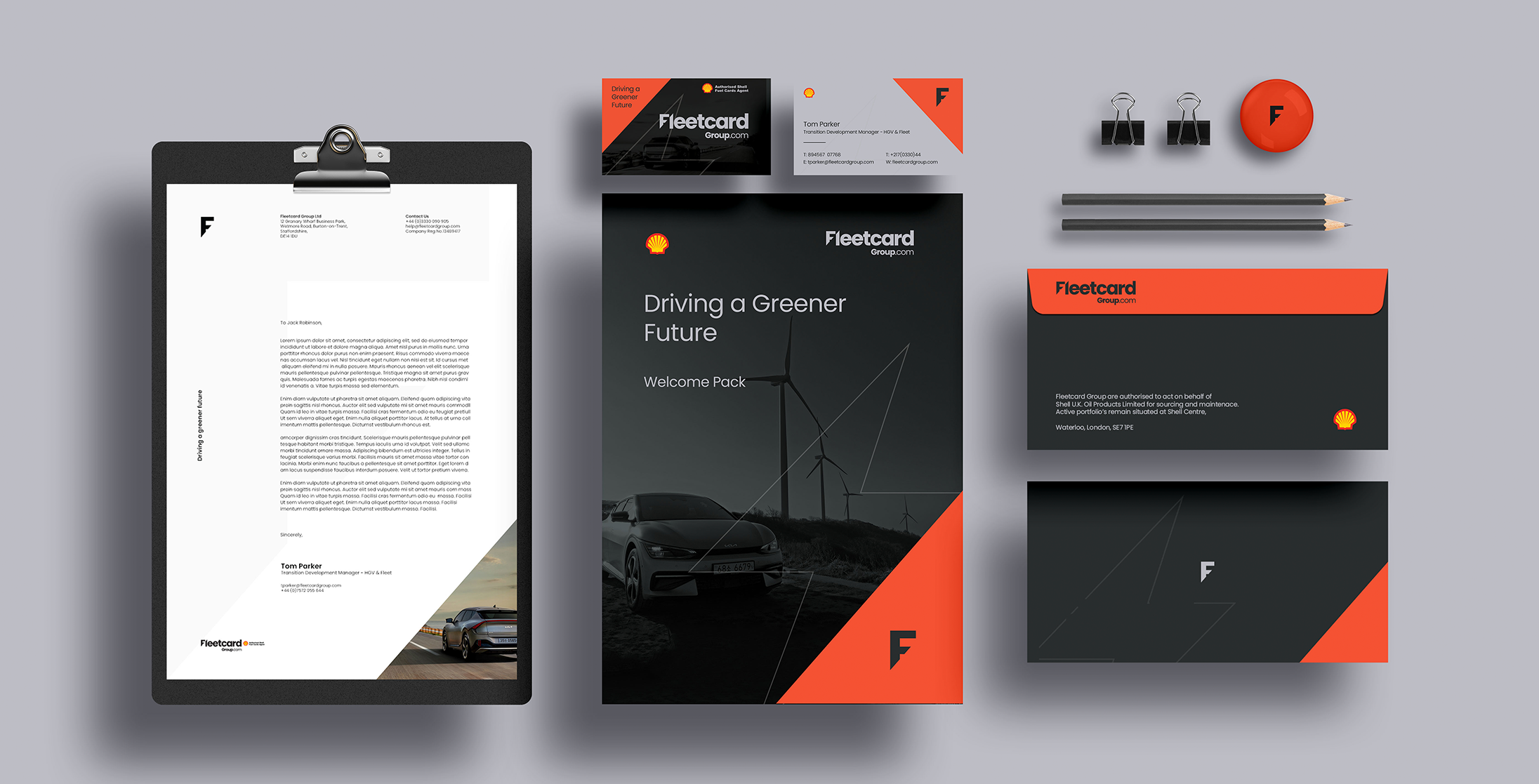
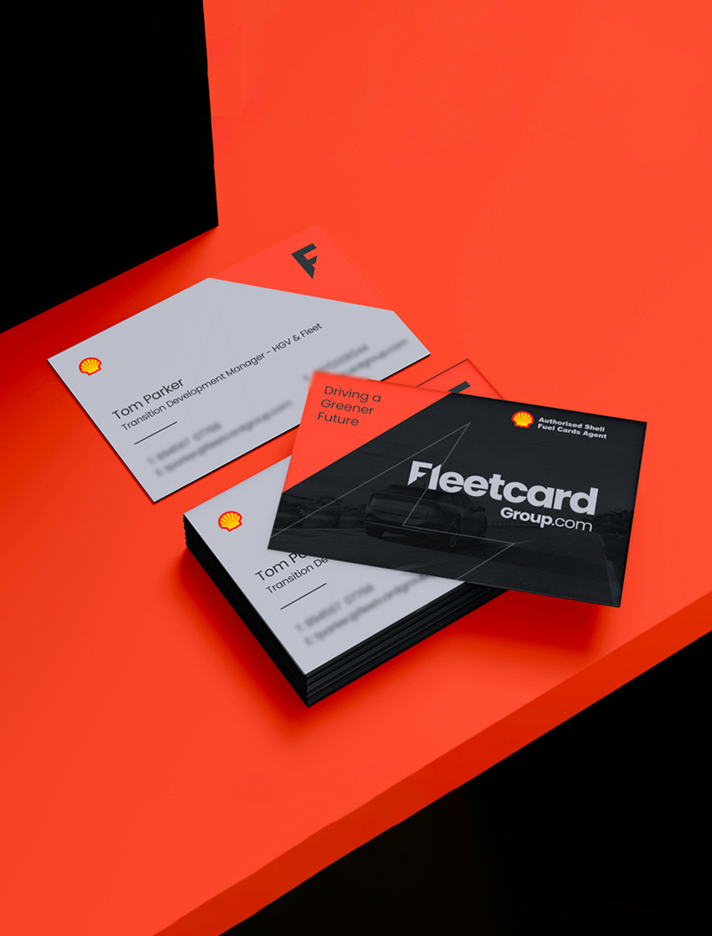
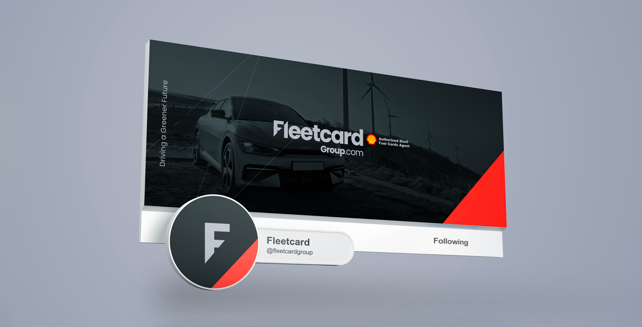
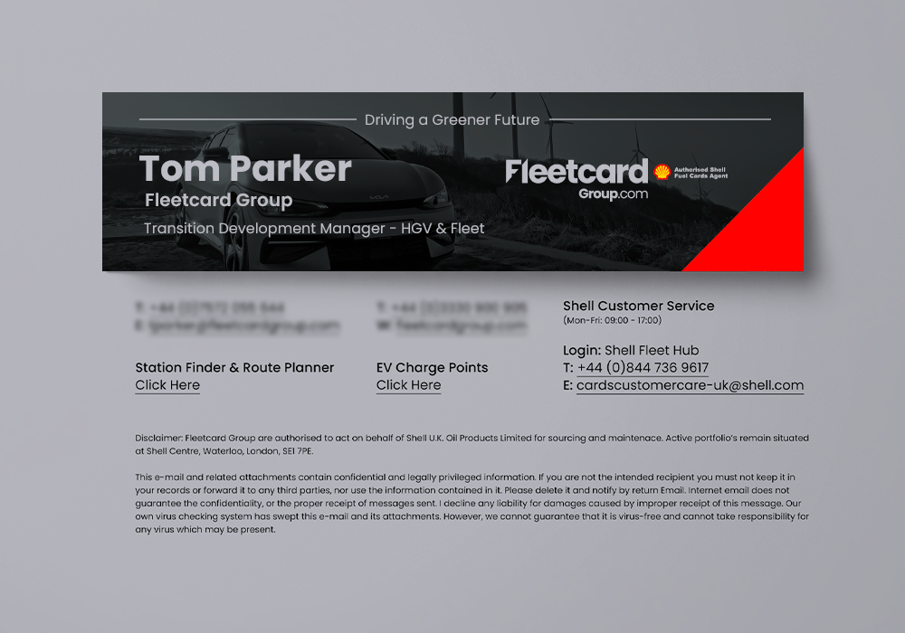
See how the Fleetcard icon, logo, colours, styles, shapes and images from the brand identity are carried across to social media posts, the perfect way to spread the word about the brand’s commitment to a more sustainable future.
